Tuesday, January 29, 2013

Guest House: After Photos


Honestly, I feel as if I've talked your ears off on this little guest house renovation of ours so I'll keep my comments brief! 

The electric fireplace makes the kitchen feel like a whole new space. 


The heat is wonderful of course, but the coziness of sitting in front of a fireplace... there's something about a mantle and a hearth that just feels good. 


The pedestal table was an Amazon purchase. Of course, I wanted to find an antique table, but the criteria for the qualities that this antique table would have to possess made the task quite impossible... a pedestal, warm wood color, 42" diameter, affordable... This table was actually unfinished so we played around with several stain/seal products on the underside until we found the right hue.  

The IKEA arm chairs came from our house. They actually don't make them anymore, which is something I discovered when Country Living asked me to source them. 


As always, there's art in the kitchen. It's such a treat. These oil paintings are by artists Cathleen Rehfeld and Eric Jacobsen

The oak butcher block counters are from IKEA. The pulls and cabinet hinges transformed the original 1960s cabinet into the style of a yet older cabinet, from the 1930s. 


The logs and light show up much better in person that in this sun lit image. It's obvious that it's not a real fire, but still offers a coziness that's a wink and a nod to the real thing. 

The Louis Phillipe-style mirror is one I bought for $35. I have so many mirrors, (and I'm quoting my husband there) it's hard to believe that I can still find ones to buy. But this just seemed like the perfect mirror for over the mantle. 

Here is a close-up of the inside of the fireplace. 


Covered with an antique fireplace screen, it looks a bit more realistic. 


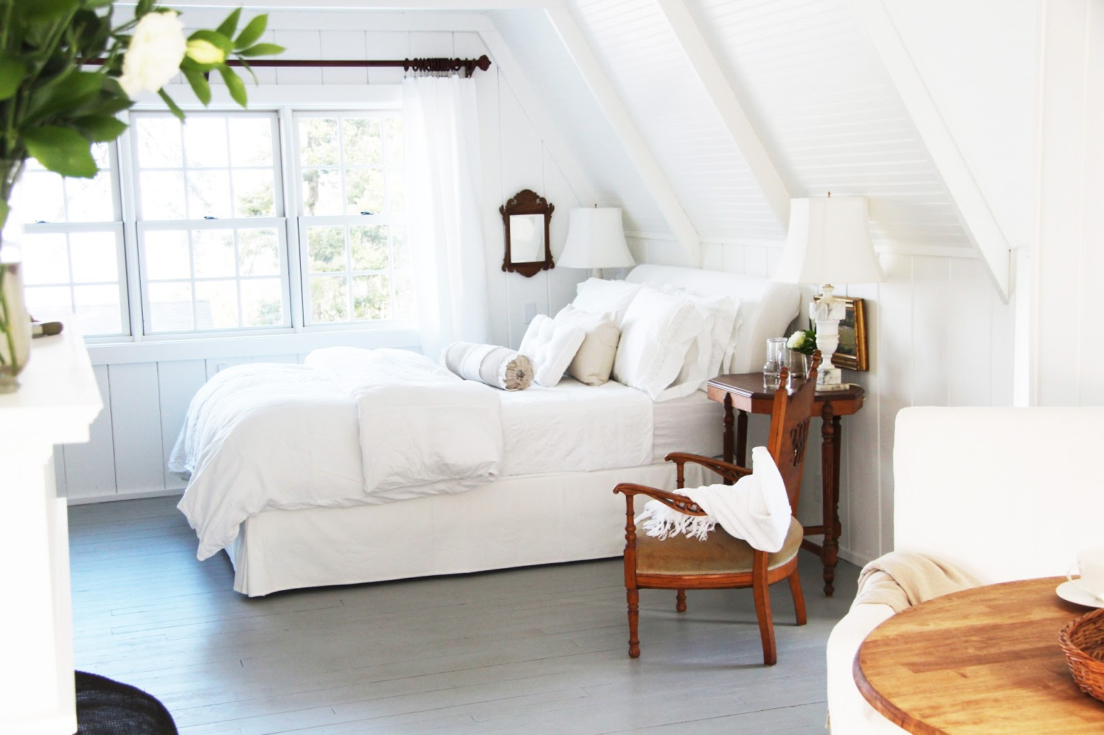
I still need to buy a rug for the bedroom. The rug that was featured in the Country Living shoot was borrowed from Crate and Barrel. 

The IKEA bed was the result of a panic that I had late one night (a few days before the shoot) when I realized that things weren't coming together quite as hoped (I intended on using an old wood bed, but the hue was too dark). I had shopped for upholstered beds at Ballard's months earlier but ended up passing on them because they were beyond our budget. The IKEA bed was a good compromise. 

This night stand is one I found last summer for $30. I liked it because of the warm wood tone, and knew that I was going to try to use pieces with a similar feel throughout the space. 

I didn't have two matching alabaster lamps, but I used two that are pretty similar in height. I married them with matching linen lamp shades, using appropriate hoops and spacers to make them the same height. 

The Chippendale reproduction mirror came from my mirror collection. I must have paid about twenty dollars for this one.


Here's a sneak peak inside the linen shelf closet. 


And here's the hanging closet. 


I found this plant stand for $20. It's the perfect size for the tiny little bathroom. 


We tiled the bathroom floors and created this enclosed shower years ago. I wish I had taken a picture of the original bathroom. It was horrible. When we lived in the guest house during our first several months on the property (as we completed the first wave of renovation to the main house), I wouldn't shower without wearing flip flops. It was that bad. 

For those who inquired into that gorgeous couch that was shown in the Country Living feature - it's not here anymore. It was brought in on loan from Rejuvenation as my Grandmother's antique federal couch that I intended to use wasn't going to be ready in time. In fact, it's still in storage in our barn as I haven't been able to shop for or decide on a fabric to reupholster it with. 

Technically, I have one more post to do - the exterior. But I'll take a break from this project of ours (for your sake) and perhaps take some exterior photos when the snow melts in a few weeks. 

In case you missed them, here are links to the behind the scenes details: 


Friday, January 25, 2013

Guest House: Kitchen & Fireplace


The old kitchen cabinet was a rectangular wood cabinet topped with peeling yellow Formica. To save money and resources, we decided to adapt the cabinet to a new farmhouse sink, install a wood counter, and add an under-counter refrigerator. 

This farmhouse sink is actually the second one we bought. The first one was too small and modern. So we opted to use one from the same company that had we used in our main house. 

You can see how the cabinet is slowly being adapted to the new sink. 

You can also see that I originally intended to use an antique French dish rack (which I LOVE) over the counter, but in the end it just didn't work. Due to the slope of the ceiling, the dish rack came out too far and interfered with the use of the refrigerator and counter. 

I am the kind of renovator that cannot move forward confidently without a lot of visual mock ups. Here, Mike created a fake counter so that I could get an idea of how the kitchen would look with a new ell. Also, he cut out a piece of fiberboard to mimic the size of the table we were thinking of using. 

The mock up also allowed us to determine where the new pendant light would go. This new light would replace the light over the sink which was removed when the new window was installed. 

Here, the new Ikea counters are in and the cabinet for the refrigerator has been built. We had to find just the right size of refrigerator (width, height and depth) to be able to run the cabinet surround evenly across from above the adjacent drawer. We wanted the refrigerator to look as built-in  as possible, so this detail was important to us. 

Once the cabinet was painted, it all started coming together. Here, the cabinet drawers and doors were removed so that we could fill old holes, paint and adhere new nickel-plated hinges. 

The last project on the 'to do' list was to build the electric fireplace. The depth and width was dictated by the size of the electric log heater, while not having the fireplace protrude into the room too much. Mike then built from there. 

He used our fireplace in the main house to determine a lot of the detail, although we decided to make it a much more simple design. 

When we were at Home Depot getting some supplies, I came across these shower tiles. They came in square packs and looked like small bricks. I thought it would be a good way to simulate a hearth. I suggested just throwing them down (I'm not the handy one in this house) but Mike gave me a look that said, "it might be a bit more involved than that." He gives me that look a lot. 

He did take a few short cuts just due to the nature of the installation (glued the tiles directly to the floor for instance) which did make it less involved than a proper tile installation. 


We bought a large sheet of faux brick paneling at Lowe's (it was a classic 60's-style red) that Mike cut down to fit in the firebox. After he spray painted it black, he came to me and said, "this is too black, don't you think?" 

I had to laugh because that was something usually I would say. I agreed of course, and so he repainted it in a grey black (you can see the difference between the two colors above). 


The opening has been cut out at this point, with the trim pieces installed. The hearth is nearly complete, with just the faux-brick installation remaining. 

I'll post after photos next! I thought I'd share the renovation phase first for those who are interested in the process of it all. 

Country Living AFTER photos. 

Tuesday, January 22, 2013

Guest House: Ceiling & Floors

In this post, I'm going to provide a little bit of the detail behind the changes to the ceiling and floors.

Here are the ceiling and floors before we started last spring. When we bought the property six years ago, the floors were covered with burnt orange carpet, and the walls were varnished pine planks. We had previously picked up the carpet and painted the walls and ceiling back in 2006. 


Here is Mike is holding up a 2 x 4 so that I can get an idea of what my idea would look like! 

This is Mike talking out the details of the ceiling with the contractor we hired to help with the carpentry. We used 4 x 8 panels of wainscot paneling and at every eight foot seam, put a 2 x 4 to simulate an exposed rafter. We added an additional 2 x4 between so that the simulated rafters are every four feet. 

I believe my brother was to arrive in less than two weeks when this photo was taken. 
I couldn't figure out why this photo looked so strange but then realized that Mike took it, so it's from a TALL perspective. It made me wonder how different everything looks to him. 

Mike took this as well. You can see that we started the beams at the wall and then went every four feet from there, to the other wall. 

Here's the end run of the beams, which ends at the wall. 

I have to say that when I walked in at this point, I had a little panic attack. It felt very busy and claustrophobic, and I started to question my entire plan! This was also three days before my brother and his family were to arrive for their July vacation.


But the white paint made everything blend and the finished project much less busy, adding just the right architectural detail to the white palette. 


A little later in the summer, Mike rented a floor sander and sanded down the floors before painting them. He's very thorough in his projects and although I argued that just a light sanding would be fine, he disagreed. And he was right. It took a little longer but the paint adhered as it should and will last a long time. 


Mr. Handy

AFTER photos from the Country Living shoot.
I will post more after photos soon. 

Sunday, January 20, 2013

Guest House: Windows


Here is a closeup of one of the old windows in the guest house. Metal frame windows from the 1960s or 1970s, you could hardly see out of them. They had both an interior and storm sash in the same casement, making them nearly impossible to clean. They also didn't open very easily and nor were energy efficient. Oh, and they were very ugly, although I suppose I don't need to mention that. 

The window on the right in this photo is that same window, which is located on the east side of the room. The picture window to the left faces north, towards the house. 

Here is the west side of the room, with the west-facing window to the left and the same north-facing picture window to the right. The east and west sides of the room are duplicates of one another. 

Here is the south end of the room, which includes the kitchen area. The bathroom is the door closest to the front door, on the right. The two doors in the foreground on left and right are both closets. 

As we did in the main house, we taped out many window patterns to try to determine the best design and size for the new windows. At first, we considered two-over-two double-hung windows, but in the end we thought that six-over-six would match the house the best (we used six-over-one double-hung in the house), and provide the most dramatic improvement. 


Here is the taping for the west-facing window. We wanted all of the windows (besides the kitchen) to be the same size and design for consistency. We also wanted to keep within standard sizes as custom dimensions are much more expensive. As you can see, we opted to lengthen the window openings. 

Here is the new east side window, after installation. 


Here is the west side window, which is the exact same window as the east side. 
We also used three of the very same windows to replace the north-facing picture window. 

The kitchen window is different in style and size. Due to space restrictions, a double-hung would not fit in this space, so we opted for a picture window with similarly-sized panes to match the new double-hungs in the rest of the room. 

Here is the west side of the room with the new windows installed, and with new paint on the floors, walls, and ceiling. 

Here is the east side. 

The north-facing picture window is now a series of three six-over-six double-hung windows (the same size and style as the two side windows). Although they are three separate windows, they were delivered as one unit. This made installation a lot easier and less costly. 

Lastly, here is the kitchen window.  This window was scooted to the left a bit so that we could replace the old window with something larger. 

Buying new windows for your house is a lot of work. 

We worked with two window dealers but neither of them really took the time to verify that the windows would all match in style, or that the window panes would come out rectangular (cottage style) rather than square (more bungalow style). 

Classic Sash and Door in Portland was the only window dealership that we encountered who paid attention to these types of details. We are out of their delivery range so we couldn't order our windows from them. Even so, they helped us tremendously. This is the second time that they've helped us as we came to them when deliberating on the windows for the main house as well. 

They are fabulous! 

The windows we used for the guest house are from Marvin's Integrity line
Their new Integrity line is almost half the cost of their regular line, without sacrificing quality. 
We used Marvin windows in the main house as well. 

HERE are the after photos from Country Living. 

Related Posts Plugin for WordPress, Blogger...